Posts

Convergence Journalism Feature Story Blog

Image
               For this group project we decided to interview Drew Sappingfield on a few different topics about his Diabetes including, the everyday struggles he has to deal with surrounding his Diabetes. We started pre production by making sure we had everything we needed for the day like a good location, camera, microphone, and everything. We also made a script of the questions that we would ask Drew to make sure the answers would inform people and spread awareness. For the interview we made sure was looking at me and not directly at the camera.      For editing I used Adobe Premier. I made sure I had enough time for this one to put in my best effort. My first version of the project had my voice over asking the questions like it was any regular interview. With my revised version I went through and redid all the video overs and made the answer connect to what I was saying and not like a straight interview.       ...

Water Color Transfer Printing Process and Experience

Image
                  In graphic design this week we used more art than computers. We created prints the old fashioned way by using mod podge to transfer the ink to noter paper.        We started by choosing our favorite project we have created this year. I decided on my Nature Man photoshop challenge. I really like the vibrant colors and the look of the project and its the one I'm most proud of. Next ! used photoshop to make a new canvas and place the original Nature Man Photoshop project next to a black and white so we could choose which ever one we though was best. Next we took yardstick paper and used our creative sides to paint a cool background. The next day after the papers had dried we took our printed projects and covered the front in Mod Podge. Then we placed the projects on to the painted paper and let the Mod Podge dry. Then on the third day we pealed the paper off of the painted paper. I accidentally got Mod...

Multi Exposure Panorama

Image
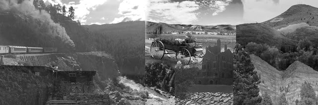
     In Graphic Design class we made Panorama's out of photos we had taken. I Choose to use photos I took from my trip to Colorado over the summer. These were photos. were memories I had from Colorado and that plays into the theme of my Panorama which is Memories.       I started by putting all the photos into photoshop from my desktop. I made them all black and white so I could find the best way they fit together to make my panorama as good as possible. I was going to try adding different colors but I really liked how it looked with the black and white contrasting each other so I kept it how it was. I used masks a lot to remove the background of some mountains and other images to make them all fit better together        Along with masks I used the transform tool very frequently to make all the photos fit together and fill up the whole canvas. I used the eraser tool at different opacities depending on the image so that the image sho...

Printing Processes

Image
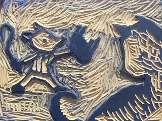
        Pressure + Ink: Relief Process- This is an older form of printing. The printer carves out whatever they want to print and then they transfer it to the paper. The printer starts by carving an image on a block of wood or metal. They then wet it and put ink onto it. They place a piece of paper or whatever they want to print it onto and they apply pressure onto the paper. Then they let it dry and brag to their friend how cool they are. Step 1: Carve the image you want to print onto your wood or metal block Step 2: Wet the block with a mixture of ink and water Step 3: Put ink on the block Step 4: Place the paper you want the image printing onto on the block Step 5: Apply pressure evenly across the paper Step 6: Slowly take the paper off of the block Step 7: Let the ink dry Step 8: Enjoy Intaglio Process- In this process you are scratching the metal itself to get your desired image in from the press. By scratching the metal you are moving it to make groo...

E-comm Procedures Video

Image
       In E-Comm our groups choose a topic based on Procedures we felt were necessary for ONW students to know how to do. My group choose to use bullying as our focus for the video, even though we knew it would be hard to fit such a crucial topic into a 30 second video.        We started in the planning phase with our story boards, we planned which shots we would need and what order we would need them in. Next we decided roles. I was the victim of the bullying and Drew, John, and DJ we the main Bullies.        Next we started filming. We started with the shot of me opening the locker. We stacked up textbooks to make sure I was centered in the frame. We started recording and them I opened up the locker, which ended up being a problem we didn't notice until editing, because the camera didn't have time to adjust to all the new light that entered the frame. Next we shot the shot of me being thrown into the trash can, which I ...

Photoshop Pop Art Project

Image
       For this Photoshop assignment we took photos with a partner and then edited the photos to look like pop art from the 50's. I choose a color filled pallet with brighter colors to make sure that it was authentic and reflected art from that time period. I began by making the background with the shapes. I originally had a spray paint looking background but it didn't look that good so I tried a few more designs. I eventually decided on the rectangular background with the multiple colors. I then took my subject and made her match with the background but stand out at the same time to make sure she was still the subject. I was inspired by the bright poppy colors and the cartoony look from pop art.        While creating this project I used a variety of photoshop tools. I used masks to cut her out of the background and then I put her onto a background that I created. I used the shape tool to create the background with rectangles. I also choose ...

Photoshop Challenge #1

Image
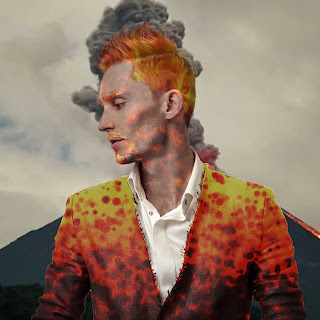
 This was a fun challenge because we were able to use our photoshop skills that we have been learning and improving on for the last few weeks and we were finally able to take control of what we were creating and sho our artistic abilities.                 I started by looking for an image that I like on Google and I inverted the colors and it made it look kind of live fire or lava so I kept with that idea and I made the rest of him fit with that theme. I used the masks to put the image over the part of the guy and then used to them to change the opacity and make both layers show through to make it look like it does. I ended up reversing the color to get the red lava type look for the jacket.                If I were to do this project again I would go for a different theme. Even though I think it turned out really nice I did a pretty common theme. I would to something more original and pro...