Posts

Showing posts from January, 2018
Image
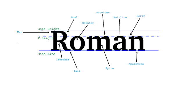
Project In Graphic Design this week we have been learning about typography. We have learned about the origins of some fonts, how serif fonts add design to the letters and how san Serif just means without Serif. We also learned about Comic Sans and how over used it is which leads typist to not be very fond of it. We also learned how to describe fonts and that is what we did in this project. Process In this project we followed along with a video to show us the new things we had to learn in Adobe Illustrator. We learned words that describe the font. In this project we used Adobe Illustrator to show the different parts of the letters. We needed 13 words to describe it to finish the project. This was probably one of my favorite Graphic Design projects we have done so far.

Making my own Color Wheel

Image
What I learned In this project I learned a lot about how to use Adobe illustrator. I learned the ways it differs from Photoshop like how photoshop uses pixels and thats why it blurs when you zoom in but illustrator it remakes the image so you can zoom without giving up quality. Process I started with making my circle. next I created a triangle that would fit in with the circle. Then I used option drag the make a new one the same size and I flipped it and made it with dashed lines. Then I made all the shapes. I created the first shape then used option drag to make them all the same size. Lastly I filled in the colors the complete my project. Take Aways Something I took away from this projects was how to use the basics of Adobe illustrator. I also know more about the color wheel like the names of all the colors, the names of their groups, what the triangles are for and much more.

Color Schemes by Logos

Image
How Logos use Color Schemes By Roman Clark  This company uses the analogous colors of yellow and blue. I think this company uses this colors because they look good and work well together.  This company used the analogous colors of green, yellow-green, and yellow. I think this company probably choose these colors because they work well together. This company used the analogous colors of orange, red-orange, and green. I think this company chose these colors because they look good together. This company uses the cool colors of dark blue and light blue. I think this company chose these colors because the cool colors go along with what they are selling.                              This company uses the cool colors of dark blue and light blue and black. I think this company chose these colors because like the first cool logo it goes along with what they are selling. This company uses the complementary colors of green and red. I th