My Wizard of Oz Poster Design
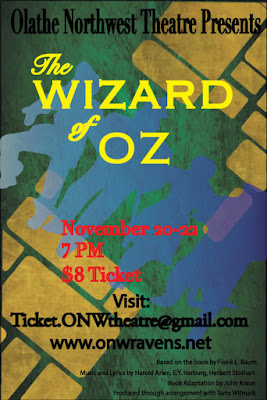
Contrast The colors on my poster were chosen because of how well they contrast together. The yellow was suppose to make the title stand out so it was seen first. The smaller text and the red coloring was suppose to make the cost, date, and time stand out next. Next the big text was used to make where to get the tickets and the school hosting the play show up next. Alignment I alligned the title and where to get the tickets in the middle. I choose to line up the date and and time and the price to the right because I thought that would be best. Lastly I lined up all the "fine print" stuff to the left. If I was to redo or edit this project I would change the red text in the middle. Repetition One thing I repeated in my poster was the font. I choose a font I like and used it for things that were similar together. I also repeated the colors a...