Posts

First set of Photoshop Tutorials Blog Post

Image
I learned a lot of useful things from this first set of photoshop tutorials. Content aware fill was something I didn't know existed that really helped me make my work look better and it helped me make my stuff look better and do it faster.         All of these tutorials I found easy but twice on the last one my photoshop stopped working and I ended up wasting in total around 2 class periods from technical problems and my work was sloppy at the end because I was sick of working on the same thing for 3 days.       Before these tutorials I knew about most of the tools that were used. I knew about clone stamp but I wasn't as good at it and I could still improve with it. One thing I didn't know about as mentioned before was the content aware fill. It's a useful tool and shows how magical photoshop is.         I know that I will definitely be able to use these tool in the future and will try my best to implement them the make my w...

Self Portrait Video

Image
I chose to play Fortnite for my video because it represents me. I wanted to show other people that I had friends, since I played with Bartle2000. My work was inspired by Cole Bartley playing rocket league because I knew I could make a better video then him so I did. Cole's video didn't show the  whole screen so I worked to make sure I got the best angle I could have gotten.        Since we could only use our phones to record I had to clear room on my desk to make sure that I could fit my phone and the whole screen on my phone. Since I don't have workin speakers all you could hear was my keyboard so that is something I would improve if I redid my video. I wanted to show my talents of being able to get a good angle and making the shot look good no matter what I'm filming. I made sure it wasn't that bright in my room so that the video would be focused on the screen and not other things in the room.       At first I wasn't planning the to s...

Quarter four reflection

Image
                                          (Included here our the Website banner, ad, and package design) About The Project     For fourth quarter we were put into groups based on our personality types. Then as a group we had to create a product together. We all had different skills that worked well together. For this project we rotated between video, animation, and graphic design and had two weeks in each rotation. Some challenges we faced were trying to find things to work on for the full two weeks. We usually got our stuff down within a week to a week and a half so we had to try and find extra things to work on. From working in our groups I learned how much four people can get done. I also learned that everyone needs to do their job and its necessary to get work done. Overall we were given good feed back on our graphics and our product but one thing we need...

CSS and C.A.R.P

Image
 In Ecomm we took another crack at creating and designing websites. We were given a template and a document showing us what we need to do with our website. When we started there wasn't any difference between the CSS file and the HTML file. Everything different between them was done by me following the document. With being through graphic design we know have our knowledge of CARP to use when designing. I used Contrast to make the important parts of the website stick out like the title and the link. I used alignment to make the website look nice and like it was professionally made. I used the repetition of the colors because they worked well and all fit together. All the colors also came from the dog. I grouped everything together that were similar like the titles and the poem using what I learned about Proximity.        I learned a lot about CSS this second time making my own website. I also got a reminder on how to do things to make the website building p...

Personality Test in Ecomm

Image
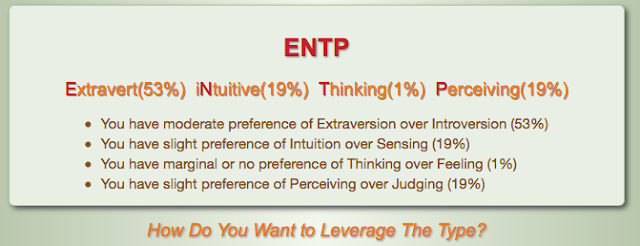
Personality Test in Ecomm My Personality type         In the personality test I took I got ENTP. That stands for Extravert, iNtuitive, thinking, and Percieving. My personality type tends to take lead of the project and lead the group. This is why ENTP people usually don't work to well in a group because they would both try and take lead of the group. I think my test results fit me fairly well. I feel like for the most part the Extravert part is right and the others are sometimes right. I could have pretty easily guessed by personality test before I test the test. This test though was still a fun thing to do and I think it's cool how we are using the results to make our 4th quarter groups.        My personality type shows why I usually take charger in a project or any group activity. A group with all the personality types would work well because they would all do their job and let everyone do their thing. For example with their...

The Process of Designing my Own Logo

Image
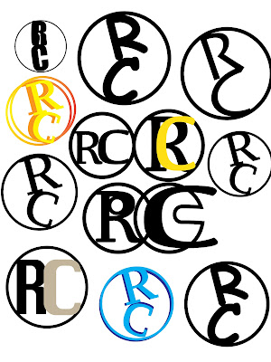
       In graphic design we designed our own logo out of our names. I chose to use my first and last initial. While doing my drawing I liked the the circle design with my drawings so I stuck with that design. I also liked the idea of the letters balancing on each other. Once I had an idea of what I wanted to do I brought it to Adobe Illustrator.        Once in Adobe Illustrator I took the logo and experimented different designs. I tried using option drag to create a shadow and then added color to it. I tried different founds and colors but decided on the yellow to red fade. I then took my logo and put it on a shirt, store, van, and sign which you can see up above.

My Wizard of Oz Poster Design

Image
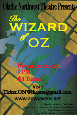
Contrast        The colors on my poster were chosen because of how well they contrast together. The yellow was suppose to make the title stand out so it was seen first. The smaller text and the red coloring was suppose to make the cost, date, and time stand out next. Next the big text was used to make where to get the tickets and the school hosting the play show up next.                               Alignment I alligned the title and where to get the tickets in the middle. I choose to line up the date and and time and the price to the right because I thought that would be best.  Lastly I lined up all the "fine print" stuff to the left. If I was to redo or edit this project I would change the red text in the middle. Repetition  One thing I repeated in my poster was the font. I choose a font I like and used it for things that were similar together. I also repeated the colors a...