Graphic Design Typography Project
Pre-Production
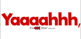
For my project I wanted to use quotes that were funny, yet I was able to change into a way that showed how I've improved after being in graphic design for so long. For fonts I choose fonts that matched the quotes and had the same kind of feeling as the quotes did.
Production
 In this project I learned a lot more from illustrator than I thought I would at first. Main I learn how to important fonts into Illustrator and what website to use while doing it. I also learned how to create a multiple art board project and how to export it with multiple art boards.
I arranged my fonts in way I thought looked fun but still professional. I made sure there was equal spacing in between them and that they were centered correctly.

 I feel like working in black and white was a great way to start our projects because we were able to focus on the layout of the quotes, the fonts we choose, and made sure everything was the way we wanted it before color was implemented. Overall I prefered working in black and white because that's what I feel like my quotes looked best in but I do like the colored ones as well.
Post Production
I feel like my project turned out very well. I just realized while making this blogger that I accidentally saved again after I drew on one my art boards and I uploaded the wrong one. Other then that there isn't anything else I would change and I am happy with my final product.


Comments
Post a Comment